
Why Your Website Needs To Be Mobile-Friendly
Think about the last time you were on public transport. Or the last time you were in a restaurant or a bar. How many people were glued to their phones? My guess is a lot.
More and more people are browsing the web from their smartphones rather than their PC, which means bloggers and web creators like you and I need to adapt to this.
By 2017, 90% of smart phone owners around the world will access information about a brand on the internet via a mobile device.
That could mean your brand.
It has never been more important to have a mobile-friendly website. So this post is for you if:
- You’re not sure if your website is mobile-friendly or how to get one
- You’re unsure just how ‘big’ the mobile trend is
- You want to know the real benefits and reasons as to why it’s so important
Today I’m sharing the main reasons why your website needs to be responsive to mobile devices and what this means for you and your brand.

But first, here’s exactly what it means to be mobile-friendly, straight from Google:
"Appearing on smartphones is critical for local businesses. 94% of smartphone users look for local information on their phone and 84% take action as a result, such as making a purchase or contacting the business."
I realise that quote says “local businesses” – but this counts for websites run by bloggers too. It works exactly the same.
What Makes a Site Mobile-Friendly?
There are four main things that make a site that works exclusively for mobile unique. These are:
- It uses text that is large enough to be read without the user having to zoom in
- It doesn’t use software that works on a desktop but not a mobile, like Flash
- It makes buttons and links large enough that can be clicked with a finger, no problem
- It sizes content to fit your mobile screen so you don’t need to scroll or zoom in - how annoying is it when you have to do that?
So if you’ve ever visited a site where everything has been too small, you’ve not been able to click on anything or some things haven’t worked, it’s not mobile-friendly.
The Main Reason Your Site Needs To Be Mobile-Friendly
A few months ago, you may remember a lot of news was surrounding Google’s latest update. If not, I’ll just quickly explain.
Google is run by a lot of different updates called algorithms. These are updated various times throughout the year – we just only hear about the biggest changes. Algorithms control how websites are seen in search engines.
A few years ago, you could write an absolutely rubbish piece of content, completely jam-packed full of keywords and get ranked in the number one position. Say you were writing about London Fashion Week. You could’ve written that in every sentence and still got into the top ranking positions on Google. Until they introduced Panda.
Panda was a huge algorithm update that targeted websites for this specific reason – having utterly rubbish, low quality content and stuffing it with keywords. When this update was introduced, all the sites that had tried these tactics in the past lost their top positions.
You know how bloggers always say to create long form, high quality content? The Panda update is the primary reason why.
So earlier this year, when Google released a statement that revealed they were launching a new update targeting websites that weren’t mobile-friendly, the online world went into overdrive. Google basically said that they were going to incorporate a site’s “mobile-friendliness” into how it would be ranked. So if your site was OK, you’d be fine. If it wasn’t, you’d disappear from the search engine altogether. It was all over digital news websites and was the biggest piece of gossip in our industry. People started testing their websites and got really panicked if they found out it wasn’t mobile-friendly.
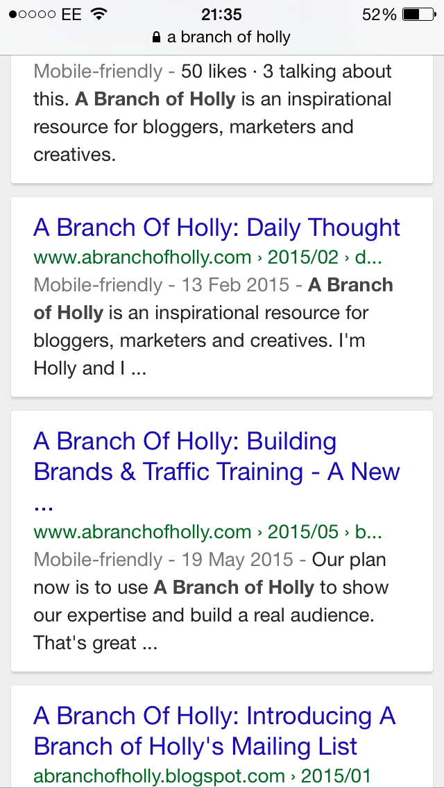
Take a look at that image above – that’s a screenshot taken from my phone.
Notice that by the search result it tells you whether the site is mobile-friendly or not?
That’s what people got scared about.
So Google’s latest update was a huge factor in making people aware of the importance of mobile. But it’s not the only reason.
There are more mobile users now than ever before
As of 2014, there were more people browsing the web from their smartphone than from their PC, and this is still true today. Even though there are some completely mind-blowing statistics, businesses still don’t seem to understand that they need a mobile-friendly site. Check these out:
- Over 20% of Google searches are carried out on a mobile
- In 2012, more than half of local searches were carried out on a mobile device
- 61% of people have a better experience of brands when they provide a good mobile experience
Numbers never lie, right?
People browse the internet on their PC and phone at the same time
In a post I wrote about what I learnt from my first conference, I explained how over half of people own a smartphone, tablet and a laptop or PC. I own all three. And I won’t lie – whilst I was writing this post, I was on the internet on my laptop doing research, and every so often I’d reach for my phone and go on social media.
Since people use multiple devices, they’ll naturally expect websites to accommodate to them. Many bloggers say readers are selfish and it’s true. They always want to know what’s in it for them, and they’ll want every website they visit to meet their needs, whether that’s on a smartphone, laptop or both.
A bad user experience means people will leave your website
If people have to zoom in to find what they’re looking for on your website, or something doesn’t work for them on there, they’ll leave in a shot. Running a website, whether you’re in this professionally or not, is a viscous game of staying ahead of whatever comes next. Your audience is the most important thing. If they’re not satisfied, you may not even have an audience at all.
A report written by KISSmetrics said that 79% of users who are unsatisfied with the performance of a website will be unlikely to visit there again. You don’t want that to happen. You don’t want to give them a reason to leave – you want to give them a reason to stay.
Your reputation will suffer
You all know the brand American Apparel, right? They fail Google’s mobile-friendly test. So apart from branded searches – basically, searches including the phrase “American apparel” – they’ve seen huge losses in their ranking positions. For one search term, “best American clothing”, they’ve dropped from page one of Google to page five.
If you’re a brand that focuses on delivering high quality to your community, how do expect those people to truly believe you, when you don’t cater to their needs with a mobile-friendly website?
Blogging and social media will naturally bring more mobile users
In July 2013 (that’s only two years ago), 93 million users accessed Facebook via the browser on their smartphone. As of 2014, 55% of social media consumption took place on a mobile device. With Twitter, Instagram, and newbies like Snapchat and Periscope, social media is a huge game player. So if a smartphone user ends up visiting your website through a link they found on a social media platforms, you’d better make sure your site is mobile-friendly, or risk all your hard work and effort into other channels going to waste.
How to know if your site is mobile-friendly
There are two ways you can check the “mobile-friendliness of your website” – and I recommend doing both…just in case.
The first is through Google’s own tool. Just put your website into the search bar and press analyse. Hopefully you should get a message like this:

The second is to type the name of your website into Google search and see if the “mobile-friendly” marker comes up on the search results.
If your website fails the test, don’t panic. You’ll be able to find a designer to get a mobile-friendly site created for you. But this is why I love Squarespace. It creates your website template for desktop, tablet and smartphone, so it looks perfect on all three. You can read more about my love for Squarespace here.
The mobile trend isn’t getting smaller. It’s growing and growing. Desktop is fading in terms of marketing your presence online. It’s about being seen and being active all the time.
The best way to do that? Mobile.
Do you spend more time on your mobile than on a desktop? Did you check if your site is mobile-friendly?
Wondering how you can use social media to boost your online presence?